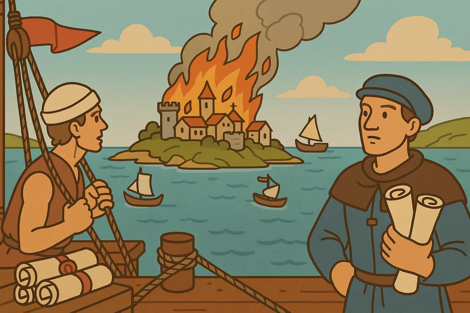
The UI shows you what's happening instead of telling you
This dev log is about Inselnova: one island, sea wars and alliance politics in a world that never resets. Play free →
TL;DR: Browser strategy games have graphics now, but they’re mostly static, a nice backdrop you still read the real state off in numbers and tables. Inselnova tries to make the picture itself tell you what’s going on. A patrolled island has ships circling it. An island under attack is on fire, with smoke you can see from the region map. A wealthy island wears a statue that grows from bronze to a twinkling gold, and treasure makes an island sparkle. This is the thing I think sets the game apart, and it’s the part my AI agents are worst at, so it’s where I do the most design work myself: I set the look of a screen before an agent builds it, and hold it to a strict style guide.
The game shows you the state
The design idea the whole game is built around is simple to say, it just takes some thinking to get right. Don’t print the state in a pill, a badge or a card. Show it. If something is true about an island, you should be able to see it by looking, before you read a single number.
That plays out all over the map:
- A patrol puts warships on a slow orbit around the island, outside the foam ring. If the crew is worn down, the ships visibly slow to a crawl.
- An intercept parks a ship offshore, holding the approach and sweeping side to side. Neutral hull, so you can see a threat is there without being told whose it is.
- An attack sets the island on fire. Stylised flames, scorch marks, smoke. The fire burns hardest right after the hit and cools over the following hour. In region view, everyone can see the smoke rising off it.
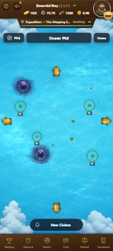
- Faith shows as a soft violet glow on the water around an island with a full reliquary. Land covers the middle, so you get a purple halo of sea.
- Wealth shows as a statue standing on the island. It starts as a dim casting, then bronze, silver, and gold, and the silver and gold ones twinkle. In most games of this type a statue is a line of text. Here it’s a thing you can see from across the map, and gold dominates the skyline more than bronze does.
- Treasure makes an island sparkle, a hint on the map that there’s something to find.
- Growth shows in the buildings. A new island is nearly a ruin. As you develop it, it sprouts housing, farms, a harbour, watch towers, a laboratory, and everyone can see how built-up you are. The main house flies your alliance flag as a rippling banner.
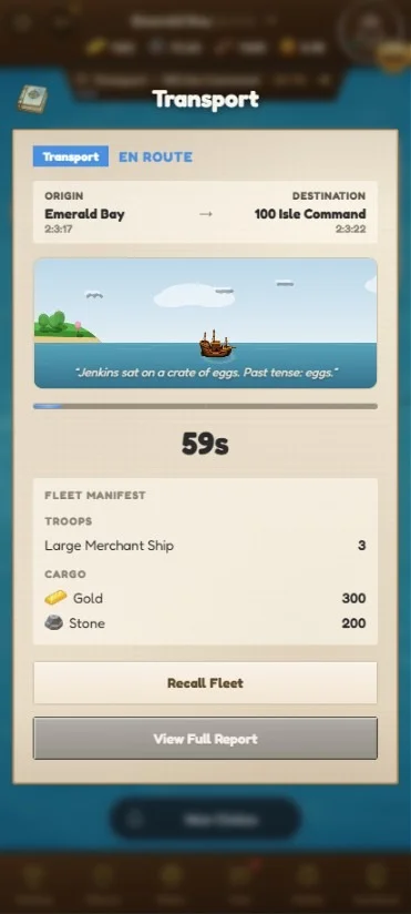
- Moving goods gets its own banner. Send a shipment and you see the island it left and the island it’s heading to, with a ship sailing between them. The islands aren’t generic art, they’re drawn from the same seed the map uses, so the trees, beach and land colour match the real islands exactly, and the world feels like one joined-up place.
- Shipping cargo leaves a wake on the sea. Move resources between two islands, by hand or on an automated route, and a faint dashed line appears between them in region view. Run it again and the line thickens. Stop, and it fades out over a couple of days.
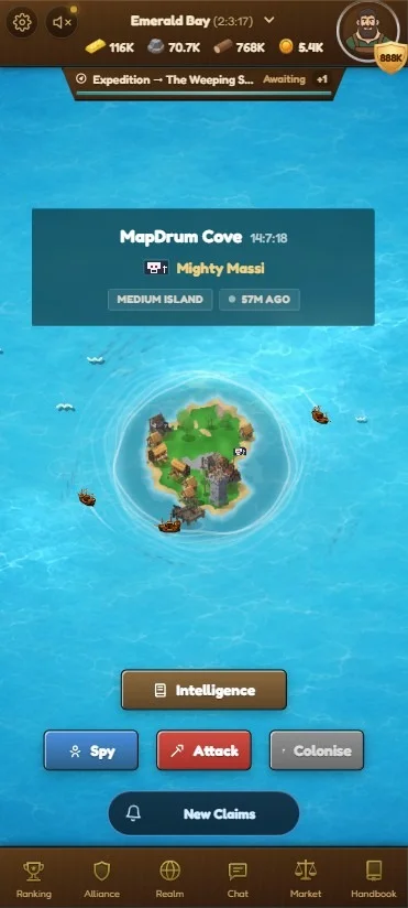
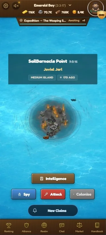
None of that is decoration. It’s the interface. You’re meant to read the state of a whole region at a glance, the way you’d read a real coastline, instead of opening six panels.
The statue is the clearest example of the difference. It’s one sprite, tinted and scaled by tier, so the same monument reads as a raw casting when you’ve chosen it but endowed nothing, then bronze, then silver, then a gold one that twinkles and dominates the skyline.
 unfed
bronze
silver
gold
unfed
bronze
silver
gold
The sea remembers where you sail
The lanes are the tell I like most, because they turn one player’s habits into everyone else’s information. A busy cargo route between two islands wears itself into the water. Nobody announces it and no panel lists it. It’s just there on the map, a dashed line with a bit of foam drifting along it, getting heavier the more the route gets used.
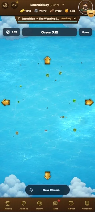
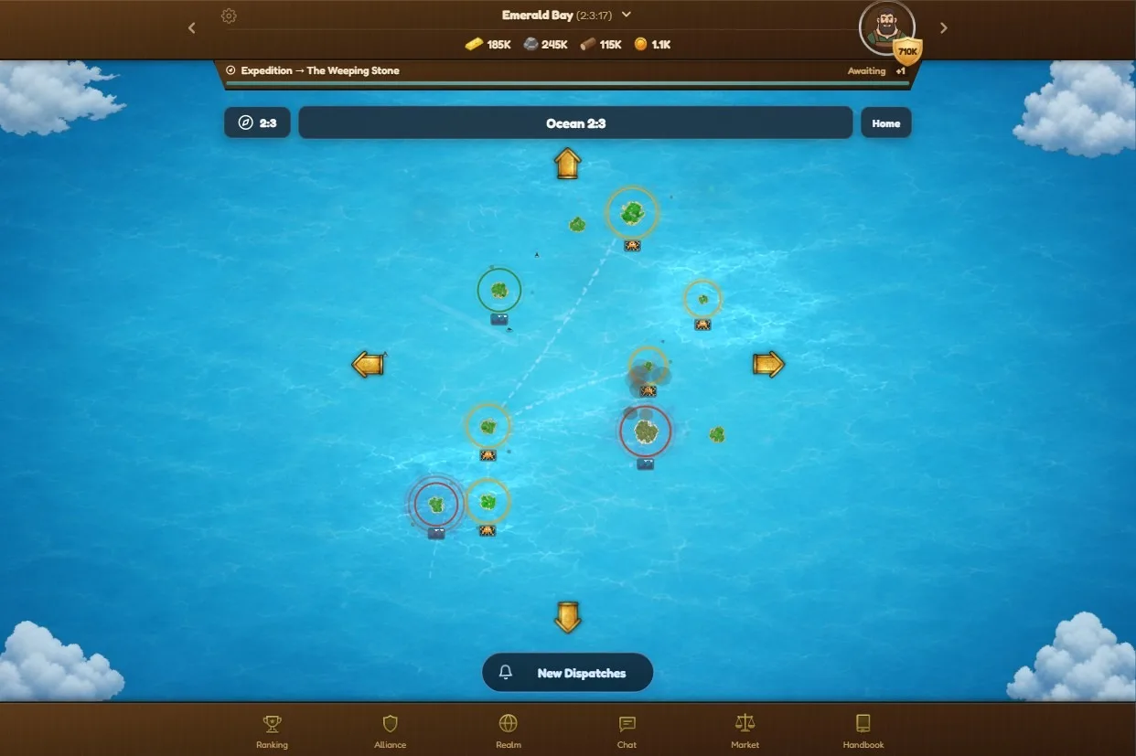 Region view. One island is still smoking from an attack, and the pale lines across the water are cargo lanes worn in by repeated runs.
Only cargo draws a lane. Resource runs, alliance depot deposits and withdrawals, and the automated trade routes. Attacks and spy missions leave nothing behind, which is deliberate: the wake is meant to advertise trade worth intercepting, not troop movements. There are three strengths. One recent run reads faint, two is medium, four or more is full strength, and it stops there, so a route you hammer fifty times a day looks the same as one you used four times. Everything decays on a 24-hour half-life inside a three-day window, so a one-off delivery is gone in about two days and a lane you stop using thins out on its own.
It follows the same rule as the rest of the map: public that something is happening, private about the details. The lane carries no owner, no count, and no direction. It doesn’t say whose ships those are, how many, or which way they were going, and if the traffic runs out of the sector you only get a short bearing stub that fades before it reaches anything. What you learn is that a route is busy, not whose it is.
That’s enough to act on. A heavy lane says cargo moves through here regularly, which makes it worth sitting an intercept across, and it hints that the islands at each end have something worth taking. The counter-play falls out of the same mechanic: stop shipping for a couple of days and the line fades, at the cost of not moving anything while you wait. The information was always in the database. Drawing it on the sea is what turned it into something players do something about.
Show it, but don’t give it away
Here’s the design problem that makes this interesting, and it’s written right into the code as a tension the rendering has to solve.
A patrol only works as a deterrent if your enemies can see it. That’s the whole point of a patrol. But if the game drew your actual fleet, the patrol would leak exactly how strong your defence is, and now the deterrent tells an attacker whether it’s safe to hit you. Those two goals fight each other.
The way it’s settled: the map shows that something is happening, and lets one real weakness leak, but never the raw numbers. Your own patrol renders as a seeded one or two ships regardless of how big it actually is, so nobody can count your fleet off the map. What does show is the crew’s grit. A patrol needs maintenance, and a crew left to run down loses grit over time, so a neglected patrol visibly slows, drifting instead of circling. That’s a real vulnerability worth reading, and it’s the one thing the tell is happy to give away. The ring only grows when allies garrison the island, and even then it widens in rough buckets, so a big ring reads as “allies came” rather than an exact strength gauge.
The intercept ship is deliberately anonymous too, a neutral hull with no identity and no count, and it only shows at all if your own watch tower could plausibly have spotted it. A blind island with no tower reads no intercept.
So the rule across every tell is the same. Public that something is going on, and public about a genuine weakness like a run-down crew. Private about exactly how much, who, and how bad. Get that wrong in the generous direction and you’ve handed players a scouting tool that reads defensive strength off the map for free.
Zooming in would look good and mean nothing
The islands used to be empty. Just a rendered island, nothing on the land at all. Players said it would be nice to have something there, so I asked the AI to draw the buildings I already had onto the island, and it did a decent job first go. I’ve tweaked it plenty since, but that’s where the look came from: a player asking, and one prompt.
The obvious next step is to go further. Let you zoom right in, see the buildings up close, lay paths between them, put people on those paths walking about. I played a lot of The Settlers years ago and that’s exactly what it did. I ran a small experiment along those lines and it half worked. With more effort it would look good.
I stopped because I couldn’t answer a simple question: what does it add? You’d zoom in once, think it looked nice, and never zoom in again. There’s no information in a villager walking between two huts. Every other visual in the game is there because it tells you something. A fire means someone hit you. A gold statue means that governor is rich. A worn lane means cargo runs through here and might be worth intercepting. People wandering around would tell you nothing you could act on.
The other half of it is where I want your attention. The game is about your realm, not one settlement, and a zoom that rewards staring at a single island pulls the wrong way. I might still do it one day, and I’d enjoy building it. But it’s eye candy you’d get bored of, and this is a strategy game, not a diorama.
Design is where my agents fall down
I lean on AI agents for almost all the implementation. They’re good at the systems, the services, the tests, the database. The one place I keep having to redo their work is this one. Visual design and layout.
It’s always the same class of thing. Padding that’s slightly off. Borders that don’t match. Spacing that drifts. A stat that should be the loudest thing on the screen rendered the same size as everything around it. Nothing broken, exactly. Just wrong in the way a room is wrong when the pictures are hung at slightly different heights. It works, it just doesn’t look like one person laid it out.
And this is the part I care about most, because I think the look is what makes the game feel different from the other games in the genre. So the area AI is weakest at is the area I can least afford to hand over. That’s an awkward combination, and it’s shaped how I work.
Setting a bar the AI has to clear
For a long time I tried to fix this with a style skill: a canonical file that pins the palette, the fonts, the corner treatment, the spacing, even a ban on the little accent bars that make a screen look like a dashboard instead of a game. It helps. It isn’t enough. An agent will follow every rule in it and still hand you a screen that looks wrong, and if you leave the layout open it’ll invent something bad from scratch. So I’ve stopped expecting the style skill to carry design on its own.
What I’m moving to is a version of the gauntlet loop. The idea there is that you don’t tell an AI to “make it good”, because it can’t tell whether it did. You give it a concrete bar to measure against, and a separate critic keeps comparing the work to that bar until it actually clears it. It’s doing good things for other games, and I’m adapting it for Inselnova.
My name for it is the bar, because the job is literally to set the bar before the agent starts. In a plan doc I draw the screen as an ASCII layout and tie it to the style guide, and that sketch becomes the standard the build has to hit. Here’s a real one, the desktop layout before any of it existed:
┌──────────────────── TopBar (fixed, resources) ────────────────────┐
├──────────┬──────────────────────────────────┬─────────────────────┤
│  left    │            middle (grow)         │      right          │
│ (fixed   │  ┌────────────────────────────┐  │  (fixed width,      │
│  width,  │  │ prestige        (content)  │  │   empty on mobile)  │
│  empty   │  │ island = WorldMap (grow:1) │  │  build-queue        │
│  on      │  │ island-actions  (content)  │  │  resources          │
│  mobile) │  │ ticker          (content)  │  │                     │
│ advisor  │  └────────────────────────────┘  │                     │
│ realm    │                                  │                     │
├──────────┴──────────────────────────────────┴─────────────────────┤
└─────────────────── BottomNav (fixed, tabs) ───────────────────────┘
It’s ugly and it’s fast and it forces the layout decision up front, while it’s still cheap to change. Every region in that sketch names a real component, so there’s no room to invent a different structure and call it done. Then I sign it off before a line is written. The rest of the flow is the same shape every time: spec the feature so nothing gets built until the questions are settled, set the bar with the ASCII screen, sign it off with me holding the next move, then build against the style guide and the conventions that say where components live and force a file to be broken up before it sprawls.
It’s still work in progress and it hasn’t made AI good at design. What it does is put a standard in front of the agent instead of hoping a list of rules is enough. And the calls that actually matter stay mine. Most of the design decisions, especially the animations, the circling patrols, the fires, the way an island tells its own story, are things I decide and AI builds. It doesn’t come up with those, and left alone it wouldn’t.
Why I keep spending the time here
I could ship faster if I let the agents lay out the screens and moved on. It wouldn’t be fine, though, it would be a mess. Dialogs would drift apart, labels and buttons would stop matching from one screen to the next, and none of it would sit in the world. This game can’t have bright green labels or plain red warnings, it has to be royal greens and reds, the colours of the setting, and an agent doesn’t reach for those on its own.
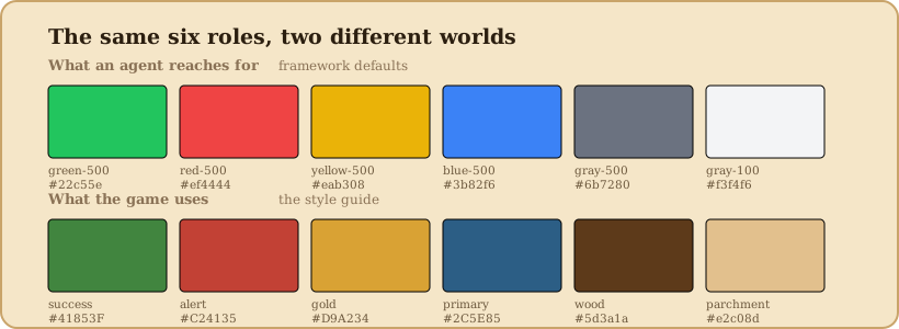
Both rows do the same six jobs. The top one is where an agent goes when nobody stops it. Every colour in it does its job and none of them belong in this game. Left alone it also forgets the overflow on a dialog, drops white text onto a light background, or falls apart the moment you open it on a tablet or a phone. The statues, the fires, the circling patrols, the purple water, the sparkle on a treasure island, that’s the difference between a spreadsheet with a map on top and a world you can read by looking at it. It’s the slowest part to get right and the first thing a new player sees, and it’s where I have the most say in how the game feels.